A few years ago I was having a look at the Twitter APIs to see what sort of data was available, and thought it might be interesting to compare the rate of content creation and deletion on the network; a measure the current level of "tweet remorse" across the globe.
I did some research, made a working prototype, and then, well, I didn't really do anything with it... Until, at the end of 2015, I had some free time and thought I'd rekindle the project with a plan to have it run and collect data throughout the following year.
Happily (and somewhat surprisingly) it all ended up working fine, ran without issue for over 366 days, and collected a lot of data for me to play with. I hadn't really planned what to do with it afterwards, other than to visualise all of it in a single place and see what a year of Twitter looks like with this dataset.
I would have been happy if it ended up looking like random noise with no obvious relationships or patterns, but as it turned out, there was plenty to see.
The video, images, and visualisation tool shown here are the results of that year of data-collection. At the end of the page there's a link to a repository containing the raw the data I collected for 2016. It is free for you to use for whatever you want. Be creative, make something fun.
The development and processes involved in recording, storing, and visualising the data are discussed below. But first, some pictures. Prints of the following can be purchased here.
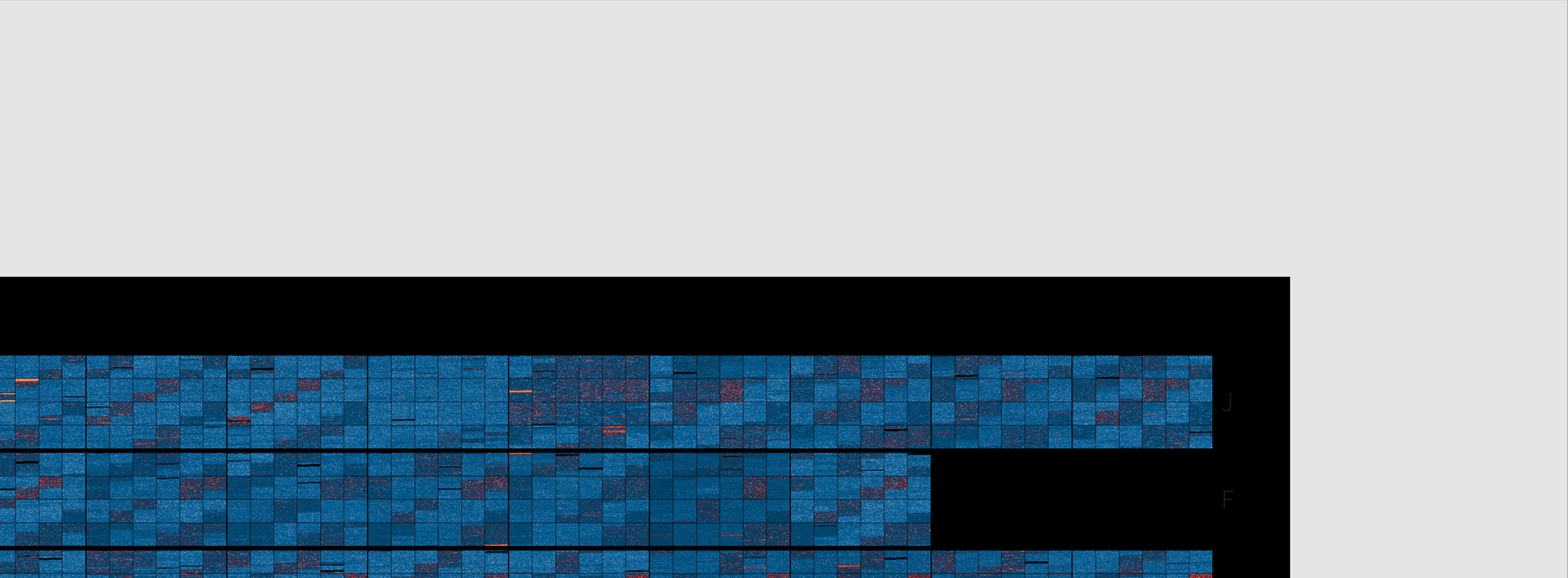
Calendar
A familiar looking days, weeks, months, layout of the data.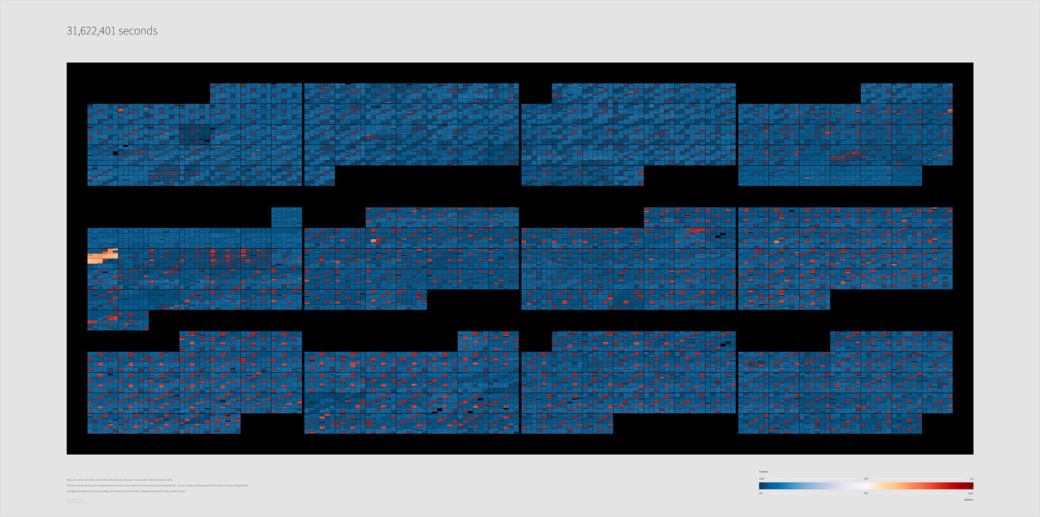
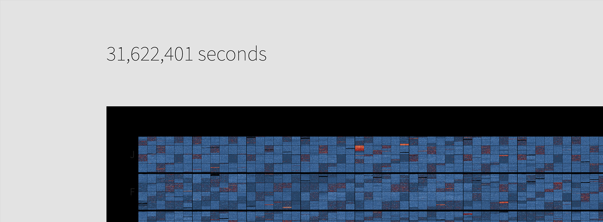
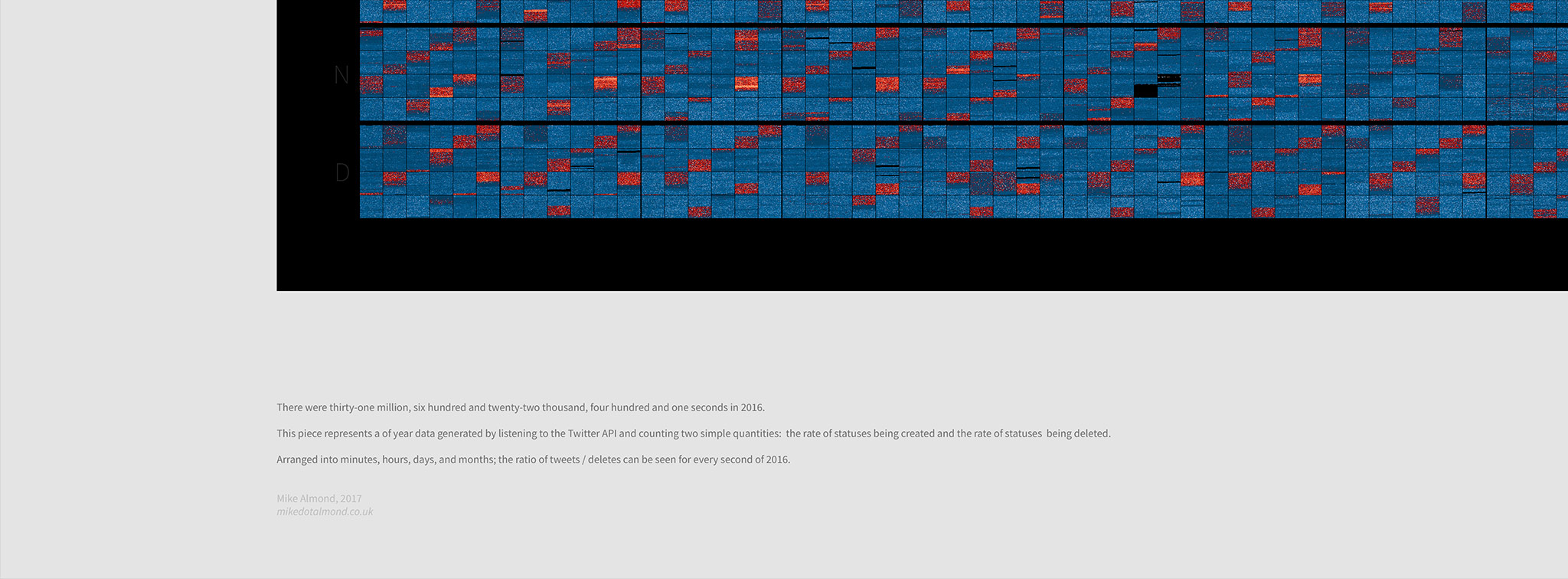
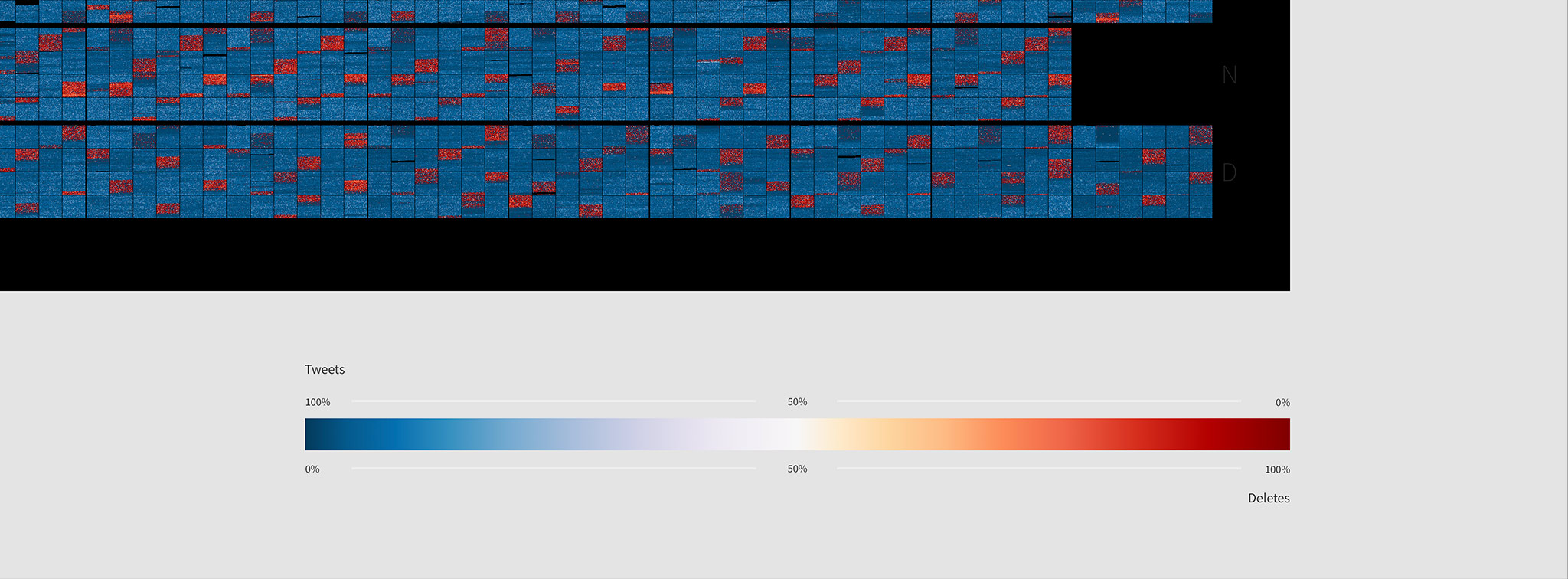
Months
Every day, arranged into 12 horizontal sequences. One for each month of the year.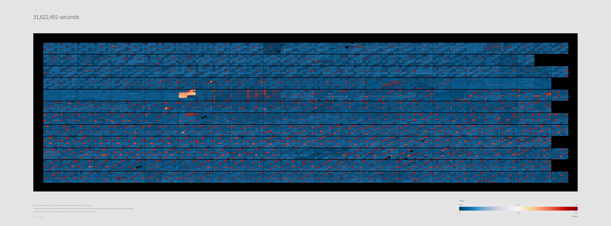
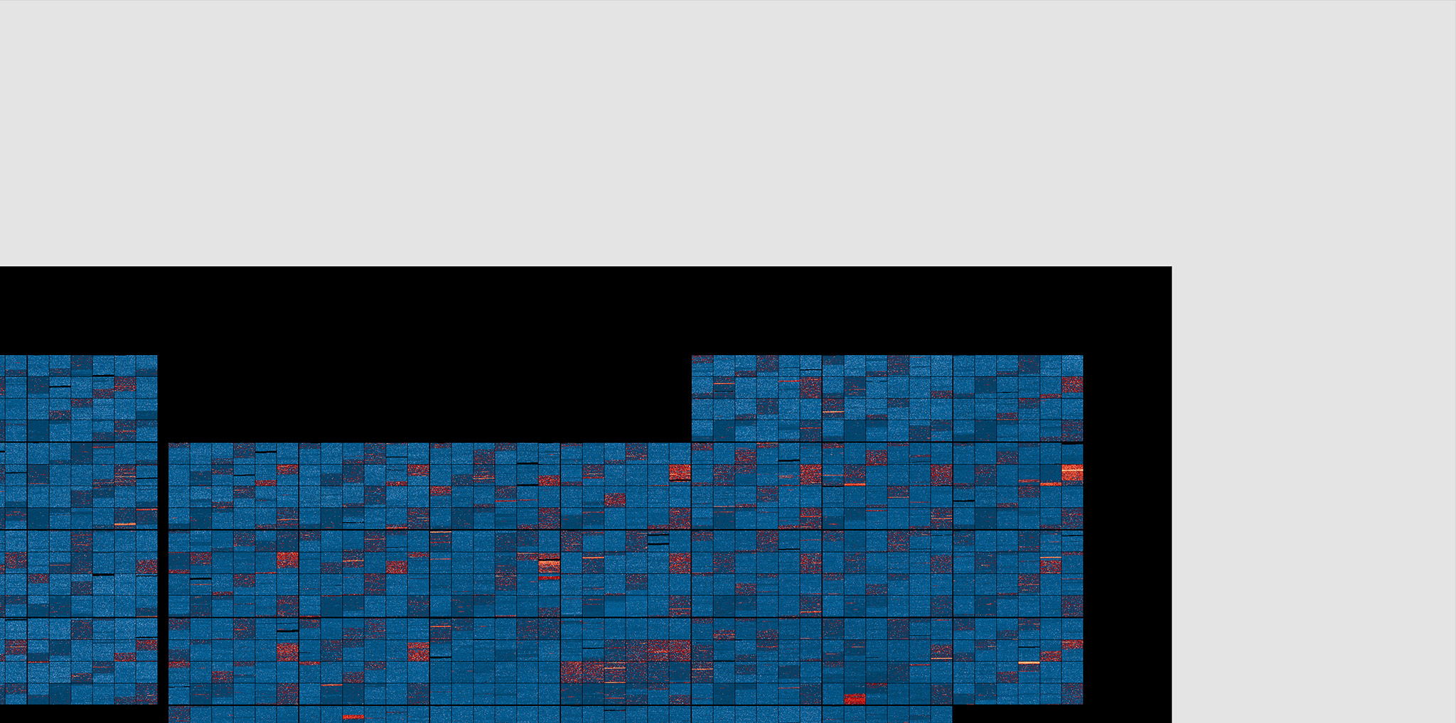
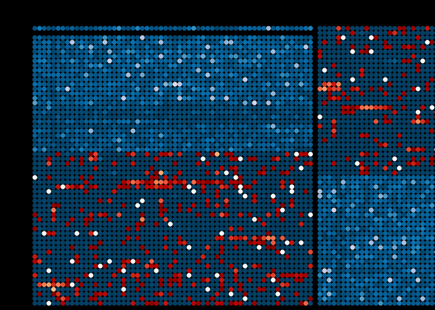
Day(s)
Taking a closer look; an image for every day. Each day consists of 24 square regions with dimensions of 60 x 60 that represent the seconds in one hour of data. Time runs from left to right and top to bottom, for a total of 24 x 60 x 60 data-points (86400) per day.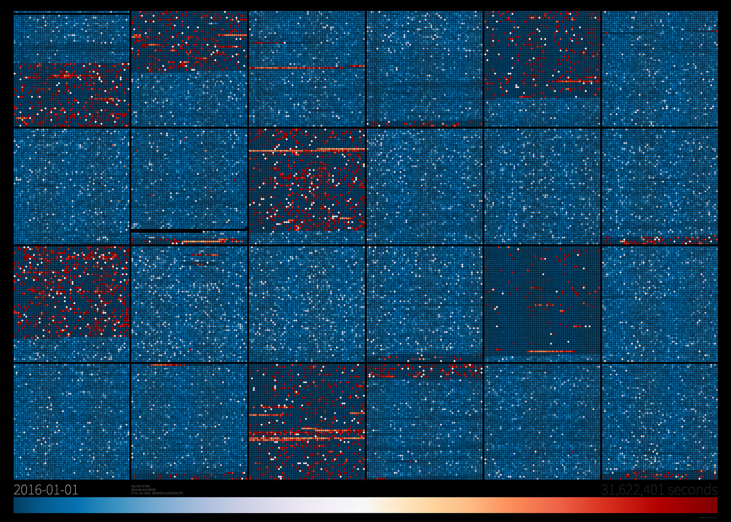
Twitter APIs
Twitter provides various streaming endpoints for accessing live data on the platform, including
GET statuses\sample which returns a small random sample of all public statuses.
So, assuming it is a truly random sampling of all Twitter activity at any given time, I thought it would provide a statistically useful resource for this kind of analysis.
That is quiet the assumption though, and it played on my mind for a while. But, I reasoned, even if the sampling turns out to be not-so-random or the API behaves in unexpected ways, that's still something learnt, and there will be plenty of data to work with regardless of what it ends up revealing.
There are limitations to the available data though. I initially wanted to store the ratio of tweet creation / deletion at the exact time things 'occurred' on Twitter by using event timestamps, and, while tweet statuses come with plenty of data, deletion events are far less useful, only providing the ID of a status that has been deleted. With a delete event, there's no way to query what kind of status was deleted, or when it was actually deleted. I could hope that a delete event would appear on the API within a fairly small window of it actually occurring, but there's no reasonable way to know for certain.
Instead of using timestamps, I decided to merely keep a count of the number of statuses and status deletions streamed from the API every second. So, the project became more about how Twitter and its API behaves over time. Would there be anything interesting or useful in that data? I didn't know, but thought it should still be an interesting thing to visualise; providing a record of Twitter API behaviour, and possibly, an indication of the ratio of tweets / deletes over time.
Data Collection
To begin, I wanted to create an application that maintained a buffer of the last 24 hours of data. It needed to provide a queryable HTTP API that could be used by clientside applications for processing and visualisation.
I also toyed with a WebSocket interface to the API to provide a real-time feed (and went as far as implementing it along with a nice little multi-LED display on a Raspberry Pi to show the current level of tweet-remorse...), but in the end I resigned that idea, and built a simpler RESTful JSON API to be queried at regular intervals to get the latest data. This had the benefit of using fewer resources, being able to be cached on the server, and could serve up more than just the current 'live' data from the application. That said, making a WebSocket server application was simpler than I had expected, and I'll probably find a better use for it later.
Data on the API comes in the form of a fairly simple JSON document. Along with status messages and timing information, I opted to provide the two integer values for the number of tweet statuses per second and the number of tweet deletions per second.
When queried without additional parameters the API returns a full set of buffers for the last 24 hours, as well as information to tell the client when the next update will be ready. Buffers each contain 60 seconds of data, with new data available every minute. Querying the API and passing the timestamp of the most recently received data ensures that it only serves data the client doesn't already have.
The API became more interesting when it was stable and I began visualising the data that was streaming in. It's always encouraging to see patterns emerge from numbers, so I soon started to think about how best to store a years worth of it. Using a database would be overkill - there are a lot of seconds in a year - and all I wanted was to store it for later use, I didn't need to query any of it. So instead, I made a separate application that would run at regular intervals to scrape data from the API and store it in daily archives for me.
This API scraping side of the workflow was also useful as a backup to the live stream application. With no local data store, if the API application went down for any reason it would lose all the data in its buffer and have to restart from empty, leaving a gap in the data record. I gave the scraping application a simple API of its own which allows the live application to pull back the most recently stored data so it can refill its internal buffer if this happens.
Serverside Development
The main API is a Java Play Framework application that uses the Twitter4J library to handle the Twitter side of things. I developed it locally before deploying to a Heroku web dyno a month or so before the start of 2016 to iron out issues and make sure everything was working as expected before 1/1/2016.
This was my first experience of Heroku, and I think it's worth saying how easy it was to get a remote application up and running from my local project repository. I don't think I ran into any issues while setting up or doing the first deployment. Everything just worked, and it continues to. So hats off to them.
Scraping and archiving of data from the API is done via a Cron job. Every 5 minutes a PHP script loads data from the API and aggregates it all into daily JSON files and a single `current` file containing the latest data. Somewhat thankfully, I didn't have to write any PHP for it, instead opting to write it in Haxe and compile to PHP :) PHP is by no means one of my primary languages, so Haxe was the perfect choice to provide a safe way to develop a standalone PHP application without constantly running into knowledge holes and errors.
Clientside Visualisation
During development I worked on a web-based tool to visualise and process data from the API. Using some three.js BufferGeometry I could display 24 hours of data at a time, with a data-point to show the create/delete ratio for each of the 86400 seconds in a day.
This web-based viewer was also used to generate the animation at the top of this page by exporting an image for each day of data. You can use it to see the current (live) state of the API or browse through the 2016 archives. Being a development tool, there's not a lot of polish to it, but it was invaluable for checking the data and trying different visualisation layouts.
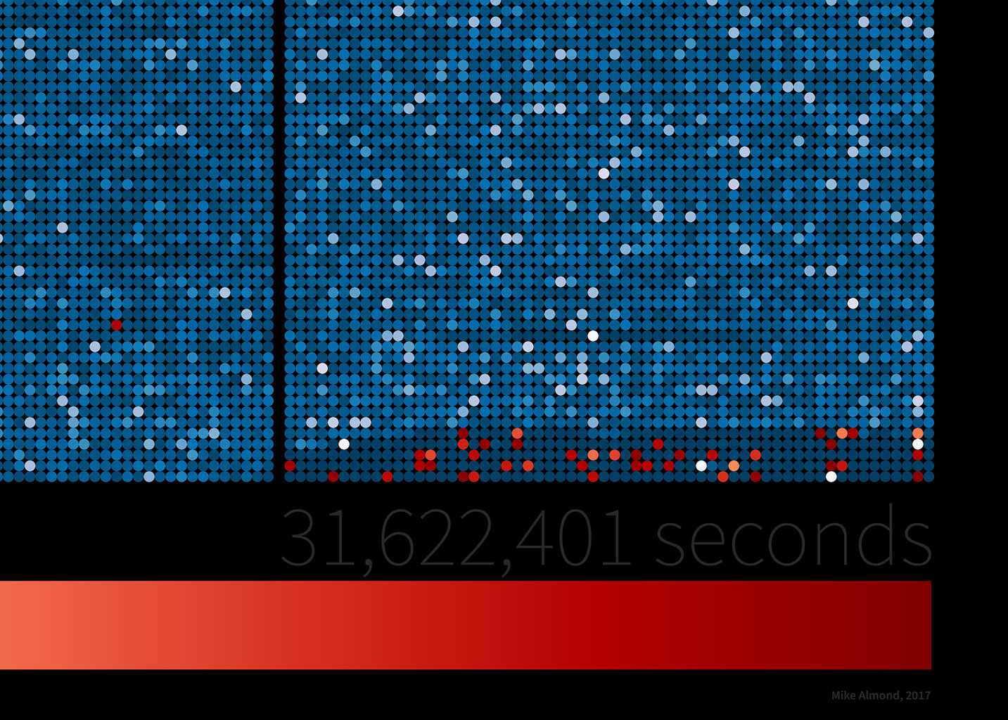
Early in 2017, with everything ready to go, I used Processing to generate some large images from the data. Converting the data-processing and colouration code from the web-based tool to Java was fairly straight forward, and I soon had the ability to output some really big images built from the data.
The two pieces containing the full 31,622,401 seconds of data were designed to be printed at 360 DPI, where, arranged into minutes, hours, days, weeks, and months; the ratio of tweets / deletes can be seen (if you look close enough) for every second of the year.
Tweet Remorse?
I'm happy how each part of the project turned out, and when viewing the year's data in it's entirety there are both clearly repeating patterns, and interesting one-off events. The simplicity of the data lends itself to being simply presented, and I'm especially happy that you can explore every second of 2016 in the full-size prints.
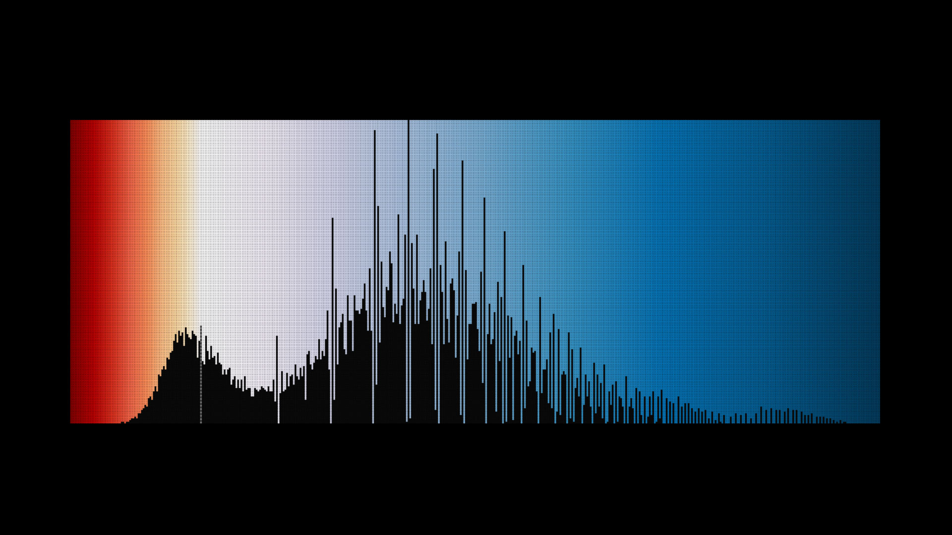
On first seeing the year in full, it's clear that something happens in May, and the data after that event looks distinct from the first few months of the year.
I don't think this due to an error in the record, I made no changes to the application while it was running and everything was working as expected. If anyone knows
if Twitter changed something significant on their systems or APIs between April and May of 2016, that would certainly be interesting.
Other than that, the most immediately visible pattern in the data seems to suggest that Twitter batches some of the deletion messages on it's API into 1-hour blocks that repeat approximately once every four hours.
Well, either that, or the random selection of statuses on the statuses\sample stream, may not be as random as expected.
But what was the level of Tweet remorse in 2016? From this data, the average daily ratio of tweets to deletes was 6.9 to 1, with a minimum of 2.0 to 1, and a maximum of 10.7 to 1 over the course of the year.
So, for (almost) every 7 tweets in 2016, one was deleted. On one day there was one delete for every two tweets, and no single day had an aggregate with more deletes than tweets.
The End?
I don't plan to release any code for the various parts of this project, it's mostly undocumented, but if there are any parts that pique your interest, then I'm happy to post a snippet or two, and discuss stuff via Twitter.
However, as mentioned earlier, I am making all of the data I collected for 2016 available for anyone that wants it. So, be creative, have fun, and let me know if you use it for anything interesting.